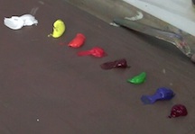
Setting Up My Palette
I set out colors on my palette from dark to light. I start on the right with magenta and cobalt blue as my darkest colors, then add permanent green, and so on until I reach titanium white all the way on the left.
Why No Black?
I discovered early on that temperamentally I can always find the deepest colors in a scene. This is a reflection of my personality, what I’ll be kind and call my natural intensity! In order for my paintings not to be too bottom heavy, I’ve eliminated all colors below cobalt blue. When I need a deep tone, something close to black, I mix it from what I have on my palette. That works out just fine.
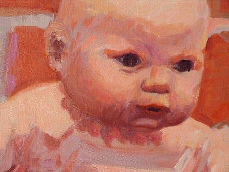
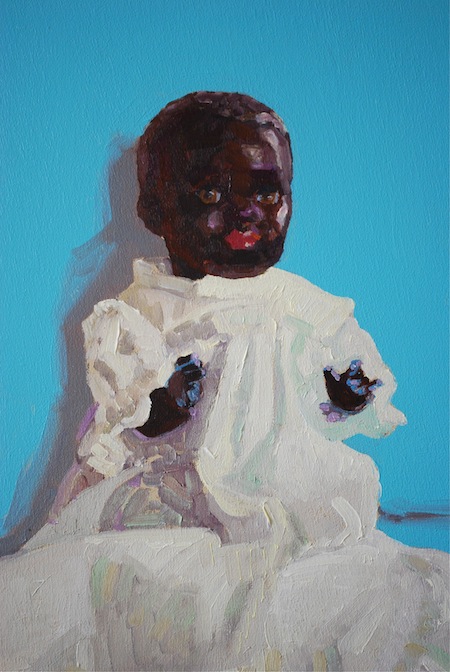
Finding Deep Skin Tones
I create deep skin tones by combining magenta, permanent green, cobalt blue, and permanent orange. Various combinations of those colors provide lush tones that are wonderfully rich. Just a hint of color introduced into titanium white is great for shadows. I rarely use any kind of earth tone in my shadows, unless I’m aiming to create a painting that feels more traditional.
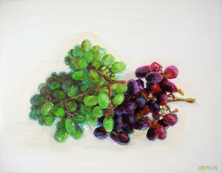
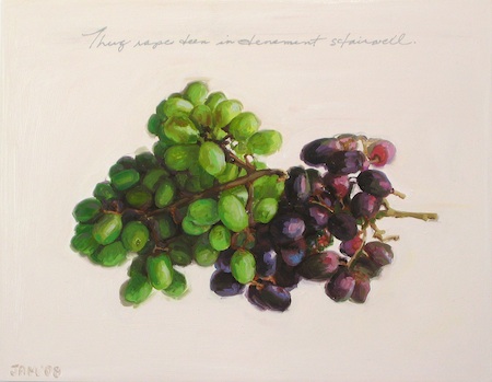
Two Versions of the Painting Grapes
These two paintings of grapes were done about a year apart. In the first version, I had not yet decided to eliminate the darkest paint colors and earth tones from my palette.
In the second version the shadows have no earth tones in them. The image is looser, and overall a bit brighter, while still carrying the intensity of the subject.