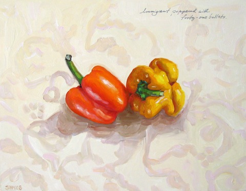
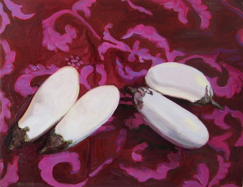
There are three whites commonly used in oil painting—Zinc White, Flake White, and Titanium White. I prefer Titanium White, a warm, luscious color with superb mixing qualities.
White is the Thief of Intensity
Mixing white into a color robs the color of some of its power. It’s often necessary to do this to match a tint in your subject, but it helps to know that this is what white does. I’m always careful to use only as much white as I have to.
Shadow, Background, Light
I create my paintings in the order of shadow, background, light. When blocking in the shadows and finding the contours in the background, I use very little white. In this way, the underpinnings of the painting are the most saturated and the most recessive. The painting is most intense in the beginning and middle stages, with the pop from the light coming at the end.
The Role of Shadows
The deepest tones in my paintings are the armature, a kind of skeleton for the light. The light sits on the very top of everything else, like a glaze, or a kiss. I use as much color in the shadows as possible—purples, blues, and greens warmed with complementary reds. I avoid earth tones, or black. Just as white robs colors of their intensity, black robs colors of their vibrancy.
Clear Colors
I paint with as many clear colors as possible, mixing them together to achieve the emotional highs and lows that characterize true luminosity.
Tints and Shades
Black and white serve the same purpose in oil painting—muting impact. Tints (colors with white in them) and Shades (colors with black in them) occupy opposite ends of a gray scale. As I’m painting, I use this basic knowledge to figure out how much of a color a color really is. For instance, a peridot green would be in the middle of a gray scale, where true gray is. Then forest green would be on the shade side, with celery green on the tint side.